LUCA

Packaging202609 / 16

Mauri

A supplement brand that had to work on a shelf, in a hand and on a screen.

One mark, one palette and one type system, resolved on press first so the printed tube sets the standard everything else follows.

The label, the range photography and the site were drawn together rather than in sequence, which is why they still look like the same brand at every size.

What was made
Identity
Label design
Art direction
Web design
Process
Dieline
Label
Print proof
Photography
Motion
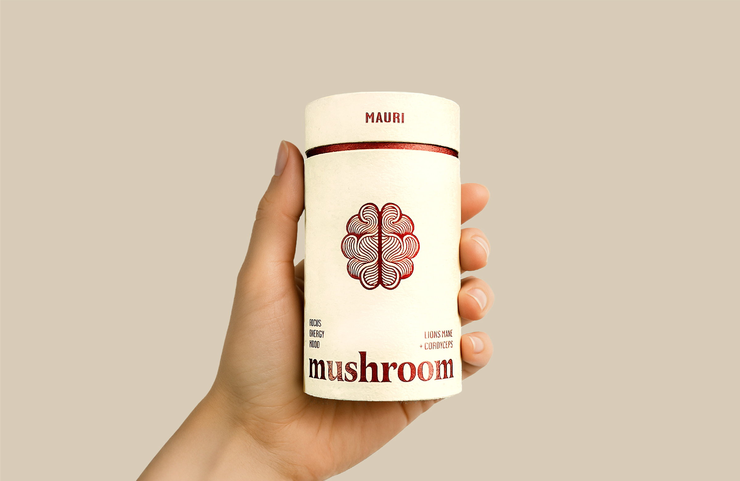
A hand holding a Mauri mushroom tube, label facing out
The tube, in the hand it was drawn for
The Mauri label artwork laid out flat: wordmark, brain mark, brain blend list, ingredients and serving panels
The label, before it curves.
Dieline for the Mauri tube: label wrap 207 by 95 millimetres, body 201 by 108.5 millimetres, top and bottom discs 66 millimetres diameter1995207766BASETOP66BOTTOM720116.5108.5
The dieline, drawn to the tube it wraps
The tube, turned
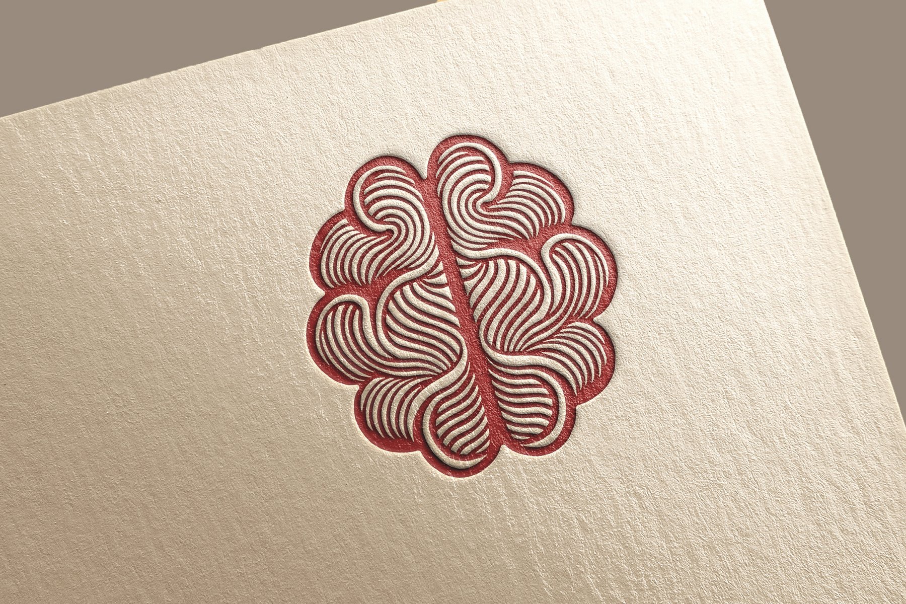
The Mauri mark letterpressed into heavy paper
The mark, letterpressed
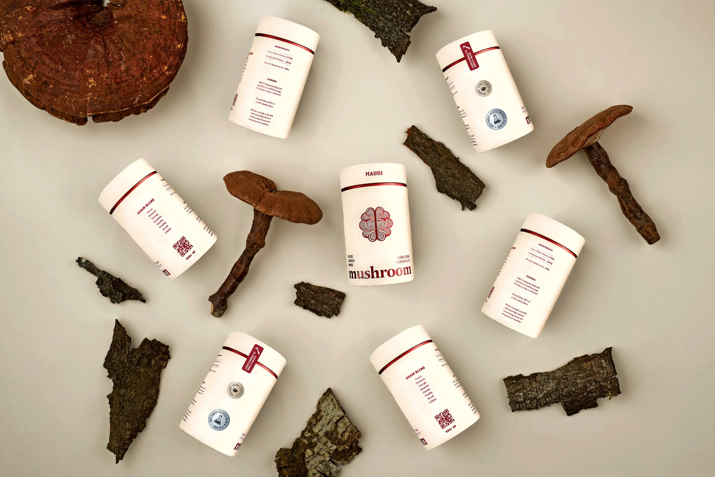
The Mauri range laid out among dried mushrooms
The range, shot with what it is made from
The Mauri brain mark in cardinal red, centred on white
The mark, at rest
The mark, breathing
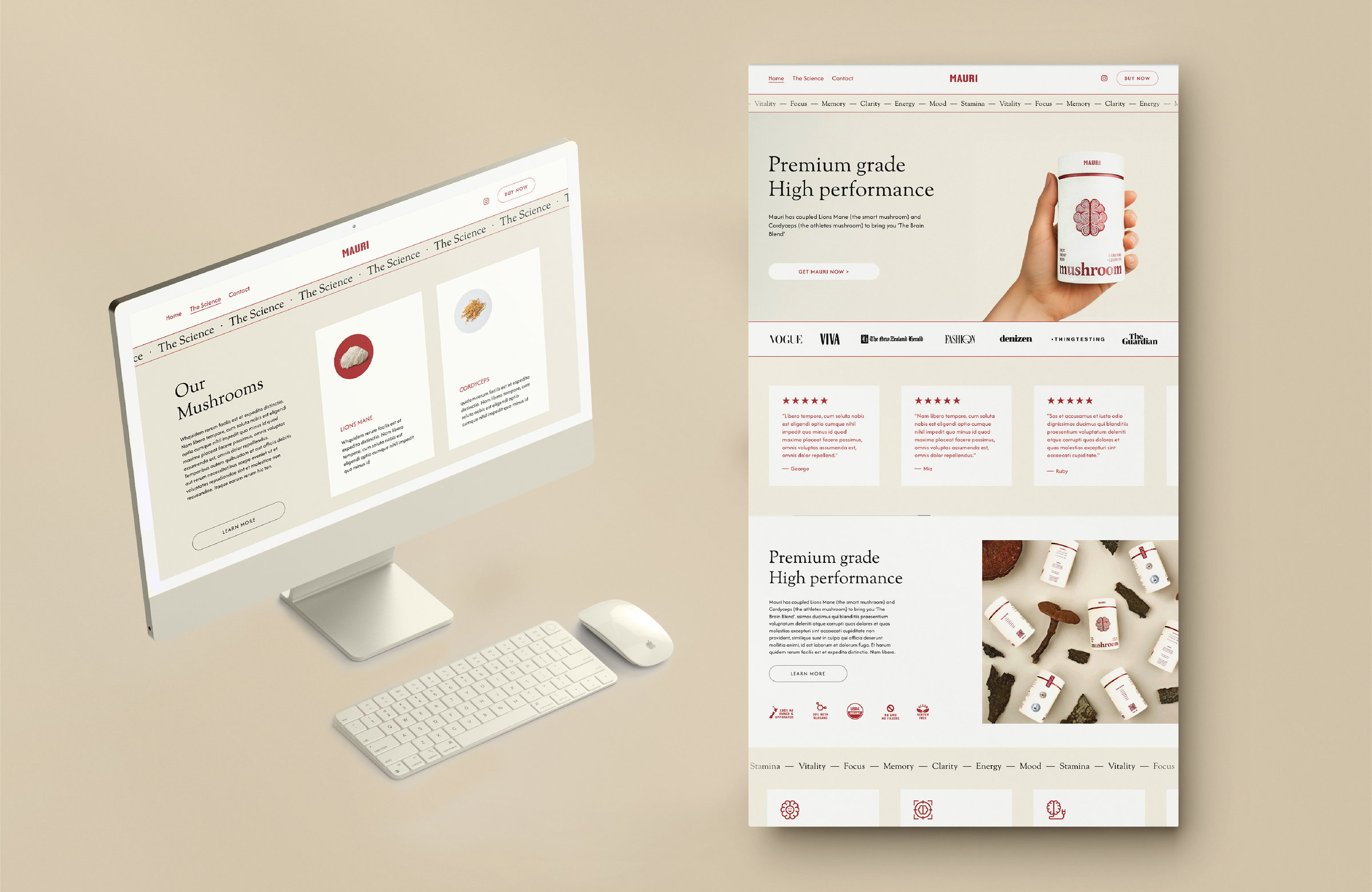
The Mauri website shown on a desktop monitor beside a long-scroll page layout
The same system carried onto the site